Wait... What actually is the Claude logo?

I've been looking at the Claude logo since May 2023. Anthropic had just released a 100k context window. A lot of people didn't really believe that Anthropic could actually provide us with a context window that large, or that the model could use it effectively.
And just this week, this message has popped up in Claude Code:
↑ Opus now defaults to 1M context · 5x more room, same pricing
But, that's not what this post is about. What I want to talk about is: what the hell is the Claude logo?
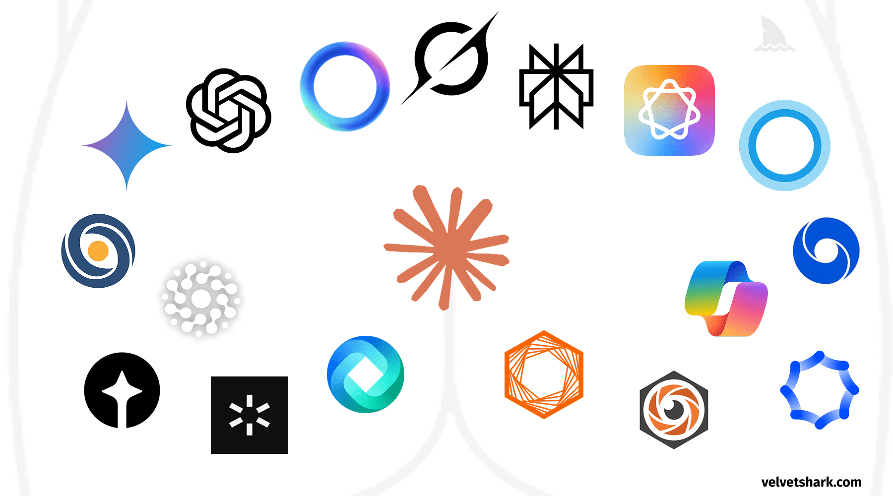
I don't know why, but I've never really thought about it. It looks sort of like a sketch. Hand-drawn. It does convey the feeling that Claude is perhaps more DIY than the buttoned-up OpenAI logo.
Is it an asterisk? *? If so, what would that mean?
Is it a sun, a star-burst of sorts?
The Elephant in the Room
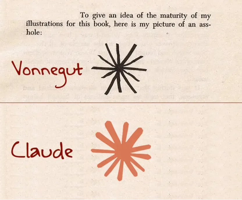
I will admit, this is not where my mind first went, but it's hard to deny—is it a butthole?
As you can see in the video loop above, it, sort of, pulsates. That does not seem like the behavior of an asterick.
Maybe it's just an abstract logo that they chose for little reason, used the company branding color, and called it a day?
Claude Shannon
Claude, after all, is named after Claude Shannon.
Donald Knuth mentioned this recently in his Claude Cycles essay.
I think Claude Shannon’s spirit is probably proud to know that his name is now being associated with such advances. Hats off to Claude!
Is there some connection between the Cluade logo and Claude Shannon? Something I'm not picking up?
Abstract, Amorphous Blob
This is my best guess as to what Anthropic is going for. I think they're trying to somehow represent the unrepresentable nature of AI, and this Claude logo is like an amoeba. An amorphous blob. It's squishy. It's evolving and adapting every day.
There's no way it's a butthole, right?